From Concept To Shelf-Ready.
A ground-up identity for a D2C skincare label, spanning logo system, packaging and launch collateral.
Where the project started.
Lumen & Co. had a finished product and a launch date, but nothing to sell it with. Early materials were built in Canva by the founding team — functional, but not premium enough to justify the price point next to established skincare brands. There was no consistent logo usage, no defined color palette, and packaging artwork hadn't even started. With six SKUs going to print and a fixed launch date, there wasn't room for a slow, exploratory process.
How it came together.
Positioning First
Before any visuals, a short discovery call nailed down the actual pitch: quietly premium, ingredient-led, not another loud beauty brand shouting on a shelf.
Logo System
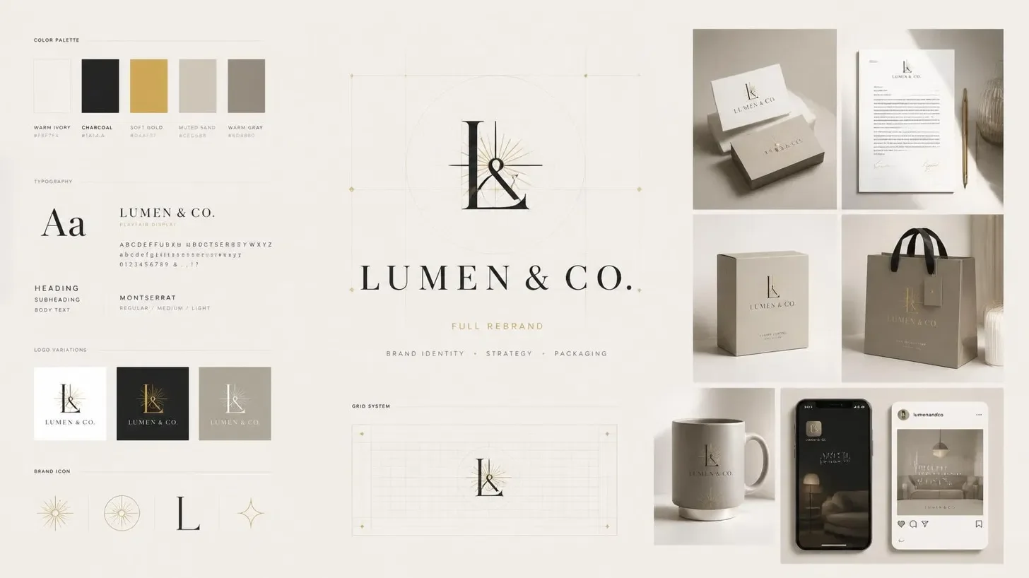
A wordmark paired with a simplified monogram — the wordmark for packaging and web, the monogram for social avatars and embossing.
Color & Type
A warm neutral base with a single confident accent, paired with a serif/sans combination that reads editorial rather than clinical.
Packaging & Launch Kit
Print-ready artwork for all six SKUs, plus a small set of launch-day social templates so day one looked as considered as the product itself.
What it added up to.
SKUs packaged consistently
concepts explored before the final direction
from kickoff to print-ready files
We came in with a good product and no idea how to make it look like one. What came back didn't just look premium — it looked like us, which was the part we couldn't have described ourselves.
Founder, Lumen & Co.
Want results like this for your brand?
Tell me about your project and I’ll reply within 24 hours with next steps and a rough quote.
Start Your Project