
A Restaurant Brand, Built From Scratch.
A self-directed identity concept for a fictional neighborhood restaurant — logo, signage and packaging, designed to show how a warm, food-led brand could come together end to end.
This is a self-directed concept project, not a client engagement — built to explore a brief and demonstrate range, not to document a real business's results. Every image on this page is genuine design work; the client is not.
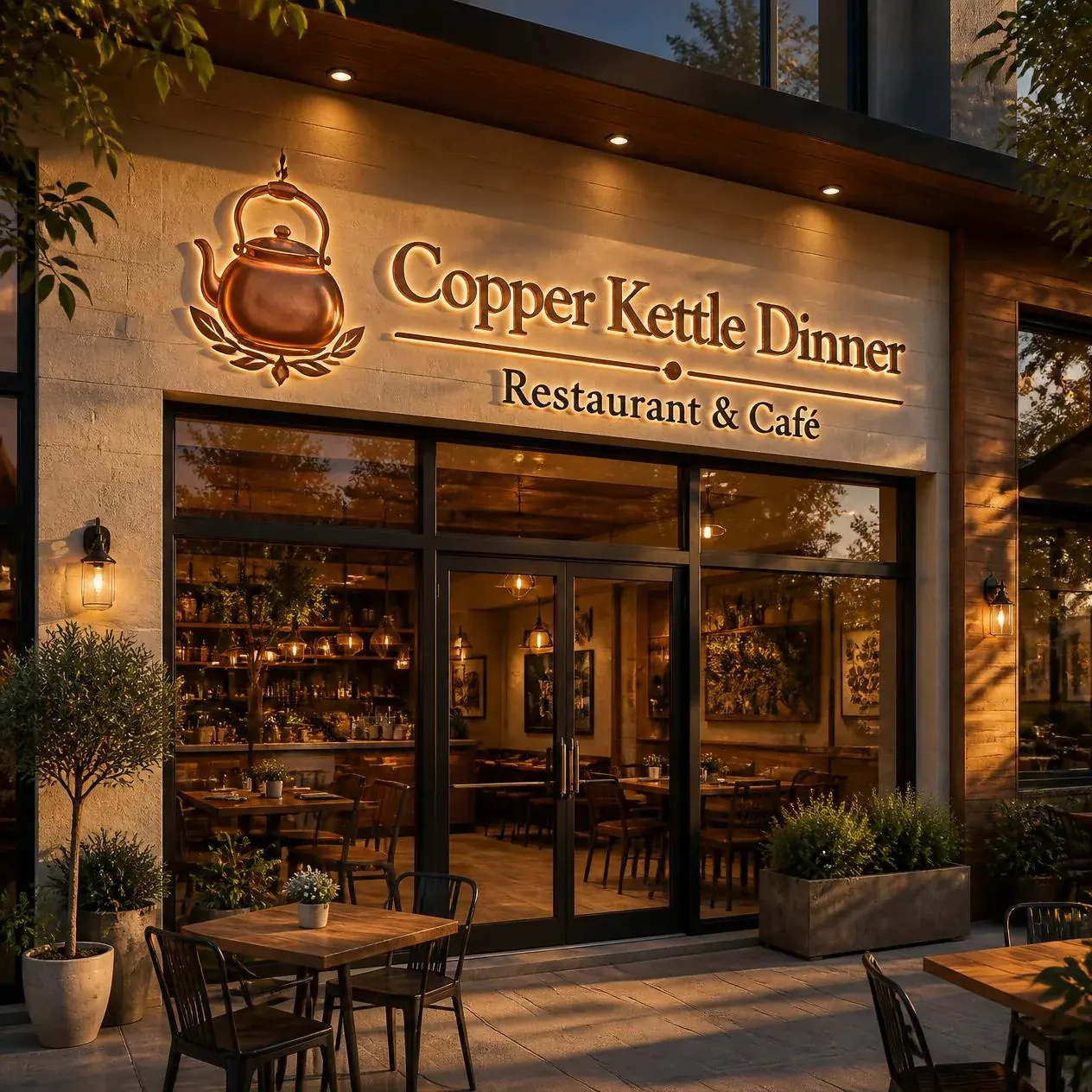
What I set out to explore.
The brief I set myself: design a full identity for a warm, slightly upscale neighborhood restaurant and café — something that reads as established and trustworthy without feeling stiff or corporate, and that would hold up equally well on a storefront sign, a takeout bag, and a coffee cup.
Design decisions along the way.
A Literal, Warm Mark
The kettle motif built directly into the wordmark, rather than sitting beside it — the kind of device that reads clearly even at small sizes.
A Restrained Palette
Copper and warm cream instead of the more expected reds and greens of restaurant branding — aiming for “established café” over “fast casual.”
Designed for the Physical World
Signage and packaging considered from the start, not adapted afterward — a brand that has to work in copper letters on a storefront works differently than one that only has to work on a screen.
A closer look.
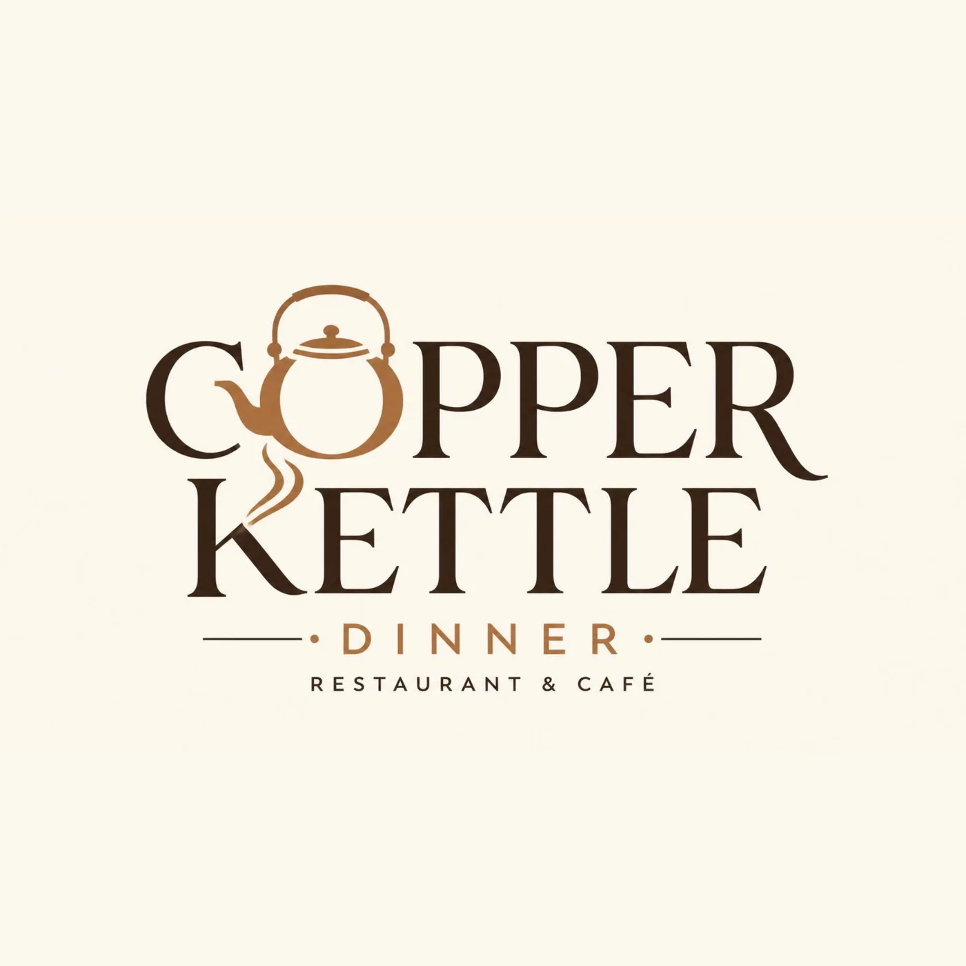
Primary logomark — a copper kettle worked into the wordmark itself.
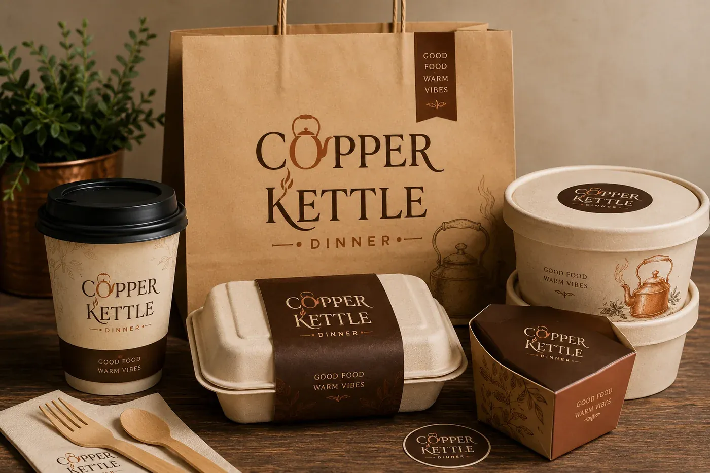
Takeaway packaging system carrying the identity through to delivery and takeout.
- 1 primary logomark plus supporting marks
- Storefront signage concept
- A full takeaway packaging system — bags, cups and containers
Want work like this for your actual brand?
Tell me about your project and I’ll reply within 24 hours with next steps and a rough quote.
Start Your Project