Exploring A Luxury Real Estate Identity.
A self-directed brand identity concept for a fictional real estate firm — exploring multiple logo directions before settling into a full applied system.
This is a self-directed concept project, not a client engagement — built to explore a brief and demonstrate range, not to document a real business's results. Every image on this page is genuine design work; the client is not.
What I set out to explore.
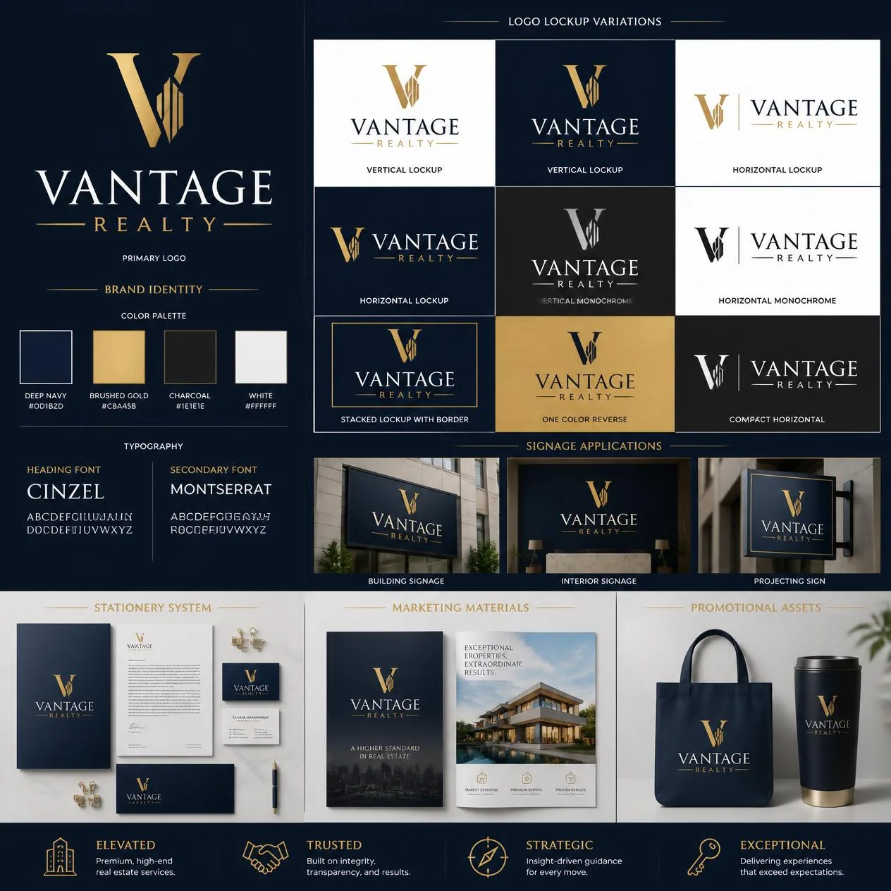
The brief I set myself: a real estate identity that reads as premium without tipping into generic luxury clichés — explored across multiple directions before committing to one applied system, the way a real identity project usually goes.
Design decisions along the way.
Multiple Directions, On Purpose
Two distinct logo concepts explored in parallel — a restrained monogram versus a more literal skyline mark — rather than presenting one idea as the only option.
A Disciplined Palette
Deep navy and brushed gold, used consistently enough that the brand would still be recognizable in one color.
Built Out Into a Full System
Beyond the logo itself: signage mockups, stationery, marketing collateral and promotional items, to see how the identity actually holds up applied.
A closer look.
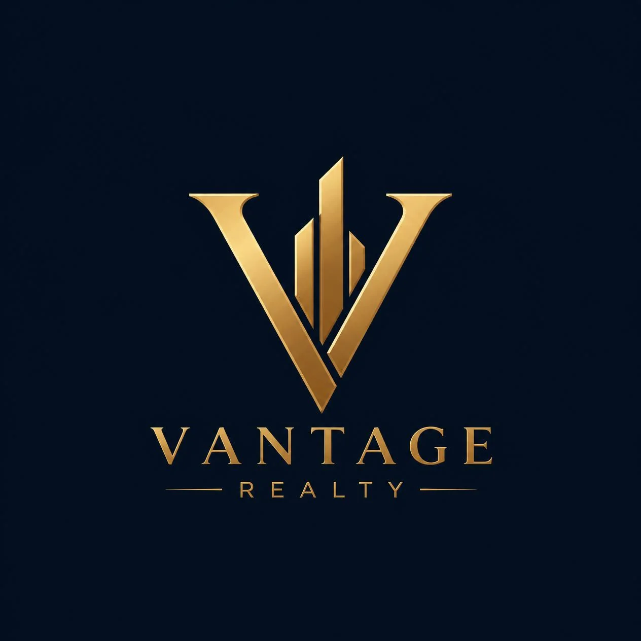
First logo direction — a minimal gold monogram.
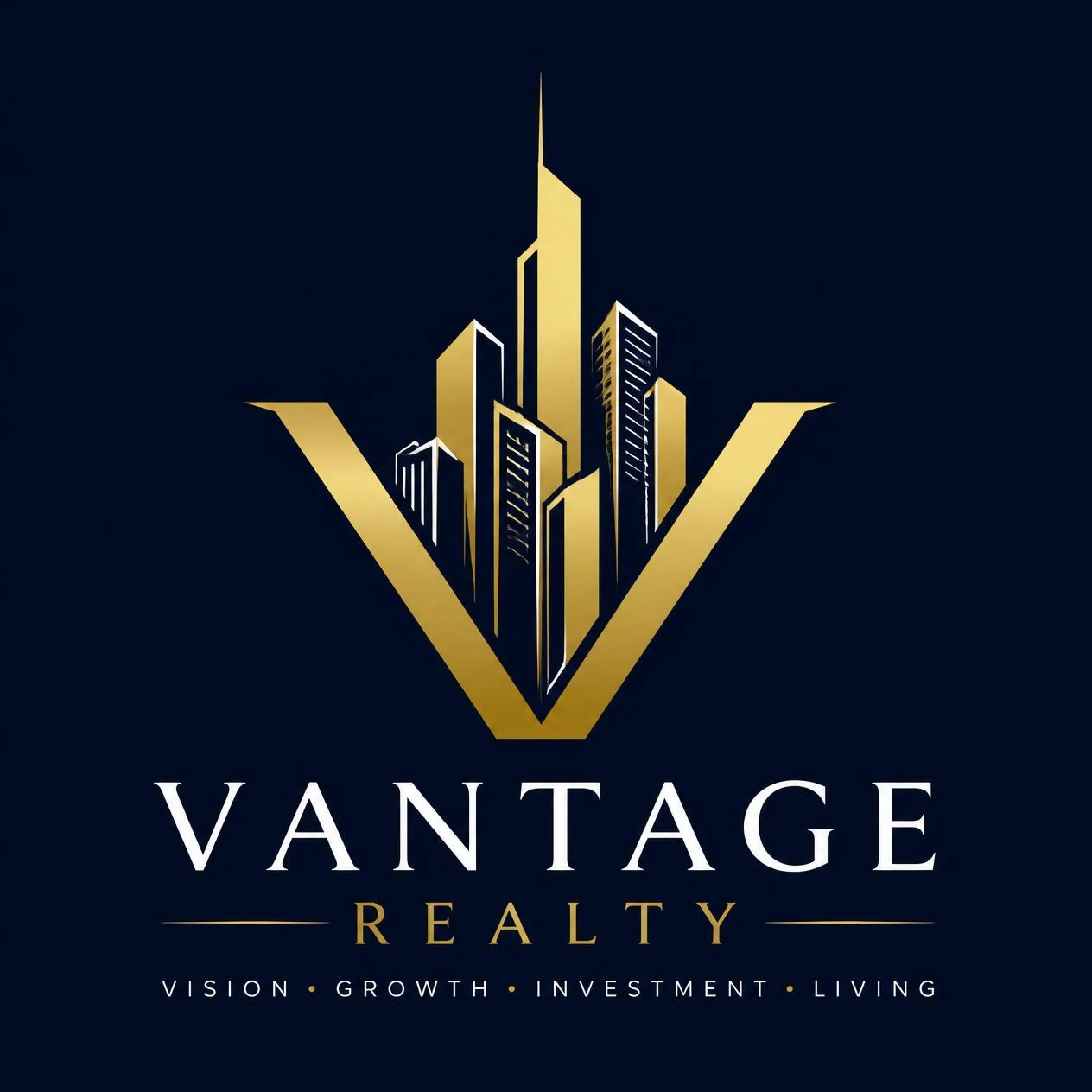
Second direction explored — a skyline motif with a tagline, for a more narrative feel.
- 2 distinct logo concepts explored
- A full brand board — palette, typography, logo lockups
- Signage, stationery and marketing collateral mockups
Why luxury real estate branding is its own category
Real estate branding sits in an unusual spot — the "product" being sold is often the single largest purchase a buyer will make, so the brand has to earn trust instantly while also feeling aspirational enough to justify a premium price point. That combination is different from most other categories: too corporate and it feels cold; too playful and it undermines the seriousness of the transaction.
Vantage Realty was built as an exploration of that balance — restrained typography and a muted, confident palette to signal trust, paired with subtle gold detailing to carry the premium positioning without tipping into cliché. The full case study covers both logo directions considered and the reasoning for the one carried forward into the brand board, signage and collateral mockups shown above. See the Real Estate Branding page for how this approach translates to an actual client project.
Want work like this for your actual brand?
Tell me about your project and I’ll reply within 24 hours with next steps and a rough quote.
Start Your Project